MUJI
The Story
MUJI is a retailer that focuses on clean aesthetics, quality, and function. They have a strong following of loyal customers, but very few of them use the website. In order to expand their customer base, a website re-design was needed to improve usability and bring the aesthetic and exploration of their physical store to the online experience.
Project Details
Role: UX Researcher and Designer
Tools: Pen and Paper, Sketch, Keynote, Invision, Slack
Timeline: 2 Week Sprint
Deliverables: Personas, user flow, sitemap, heuristic
analysis, mood board, c + c analysis, lo-fi wireframes,
hi-fi wireframes and clickable prototype
Original 'Online Store' Home Screen

Re-design Home Screen

The Final Design


I Re-designed the primary navigation to be product-driven
I colored the bread crumbs to make them stand out because users missed them in the original site design
Users love MUJI's clean, simple, functional design so I let that lead my design aesthetic
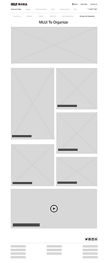
I divided the 'organize' page by rooms in a house because that fits the language of the user
Users go to MUJI stores to discover and be inspired, so I featured Muji brand inspiration categories to optimize browsing and mimic the in-store emphasis on discovery
Users enjoy the promotional videos on MUJI's site so I kept them in the re-design. I don't believe in fixing things that aren't broken.
I removed the giant store locator map because all users looked to the top navigation bar when prompted to find a store

I kept MUJI's large bedroom hero image so users could see the room up close and envision it as their own
This bed was on two separate pages for two separate sizes which confused users. I combined them and added a size selector
In physical stores users can 'buy a room' so I included that option on the site
I made every product picture a link to its corresponding product page so purchasing would be streamline and easy
I added a bed 'accessories' section (or 'like items') to encourage users to purchase sets instead of just individual items

Users were confused by some of the product pictures so I depicted them in a clearer way, demonstrating how they look combined as a set
My Process
I keep a fine focus on the user throughout the entire project, asking the right questions and solving problems before any code is written. For MUJI I interviewed a wide range of users and tested through a multitude of iterations
There are 3 primary steps I follow for UX design:
1. Research
• Concept Mapping
• Contextual Inquiry
• Heuristic Evaluation
• Competitive Analysis
• User Interviews
• Persona
2. Build
• User Flow
• Card Sort
• Site Map
• Mood Board
• Design Studio
• Sketching
3. Test
• Wireframes (low resolution)
• User Testing
• Wireframes (hi resolution)
• Clickable Prototype
1. Research
The Research phase is the beginning stage where I gathered information about both the company and its users.
Contextual Inquiry
I start with contextual inquiry whenever possible to gain an unbiased view. I observed the users' behaviors in store and online.

In-Store
MUJI users at the store would browse casually throughout the store. They interact with displays, play with the stamps and stationary, and sit on the furniture. MUJI brand steamers are always on shooting steam and calming essential oils into the air, and people relax upstairs on giant bean bags. The in-store users have a sense of discovery, peace, and playfulness.
Website
Users are instantly frustrated when they click on images of products they are interested in, only to find out that the link they clicked on doesn’t connect to the “online store” which is a separate web page entirely. Users also have difficulty finding what they need because they find the organizational categories to be unrecognizable.
Heuristic Evaluation
I started by evaluating logistical problems with the current website design before getting any users involved with testing.
The issues that came up the most were:
CONSISTENCY AND STANDARDS
“seems familiar, makes sense.”
- The website doesn't match the physical store.
- The homepage doesn’t match the “online store.”
FLEXIBITLITY & EFFICIENCY OF USE
“allow me to do more or less”
- Categories are all over the Place.
- Promos don't link to products.

Competitive Analysis
I compared my heuristic evaluation results with the client’s competition.

The most significant finding was that all the similar e-commerce websites had their main product categories displayed in the primary navigation bar at the top of the page. This was a strong indicator that users are likely to intuitively search the primary navigation for products.
User Interviews
To gain further insights into the users' pain points and form a persona. This was the most informative stage of the project

I learned that the website needs to make it easy for users to find organizational products, and be able to browse solutions the way they would in the physical store.
I found that users go to MUJI to solve their organizational problems. Whether it is in relation to home, office, or travel, users find solutions there such as organizing a tiny suitcase, finding a trash can small enough for their studio apartment, finding the most minimalist toothbrush holder, or creating a clean workspace.
Users complain that the website is 'confusing, cluttered, and stressful to navigate.'
Responses to the question "WHY MUJI?"
2. Build
The Build phase is where I was able to implement all of my gathered research into a visual design.
Persona
Combining all the data from user interviews and contextual inquiry, I formed a persona to guide and inform the design process.

User Flow
I mapped out the user scenario showing what steps the user must take to reach her goal. This guided my design and informed what pages I needed to build (and in what order).

Site Map
To keep things organized and simple, I created a site map for the main navigation to make sure all the categories and products would be organized and accounted for.

Card Sorting
MUJI has an impressively large number of products that fit into a plethora of different categories. To organize them I first did an open card sort, and then I had users arrange labeled post-its (closed sort) into the categories they thought made the most sense.

Mood Board
Design and aesthetics are extremely important to the MUJI persona. Therefore I needed to give a lot of careful attention to the overall visual effect of the re-design. The mood board was very helpful in informing my color scheme for the site.

Iterations
Starting with rough hand sketches, I performed user testing with a large sampling of MUJI users for each iteration of the design process. I wanted to ensure the navigation made sense and was intuitive to use.
HOME SCREEN


I removed the store locator map from the bottom of the page because when I asked users to locate the nearest store, they would go straight to the store locator icon in the top navigation bar. I also changed the first hero image to 'Organize' instead of 'Relax' because the user goes to MUJI primarily for organizational products.
'MUJI TO ORGANIZE' SCREEN

This was originally intended for the Home Screen, but its organization by rooms in a house neglects the travel and clothing components of MUJI.
Also, users commented that they never see the first image of a carousel so I changed the hero image to be stationary.